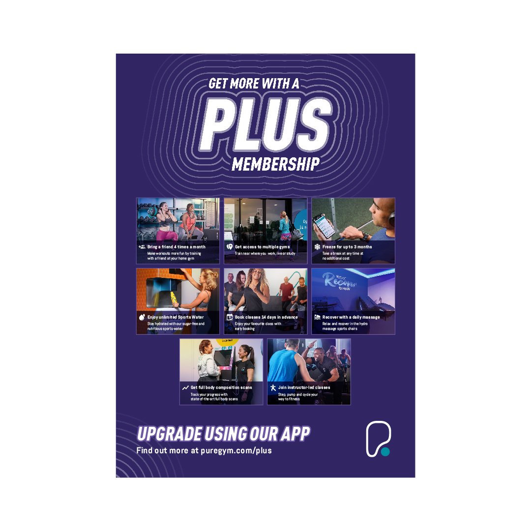
The redesign of the extra value memberships for PureGym.
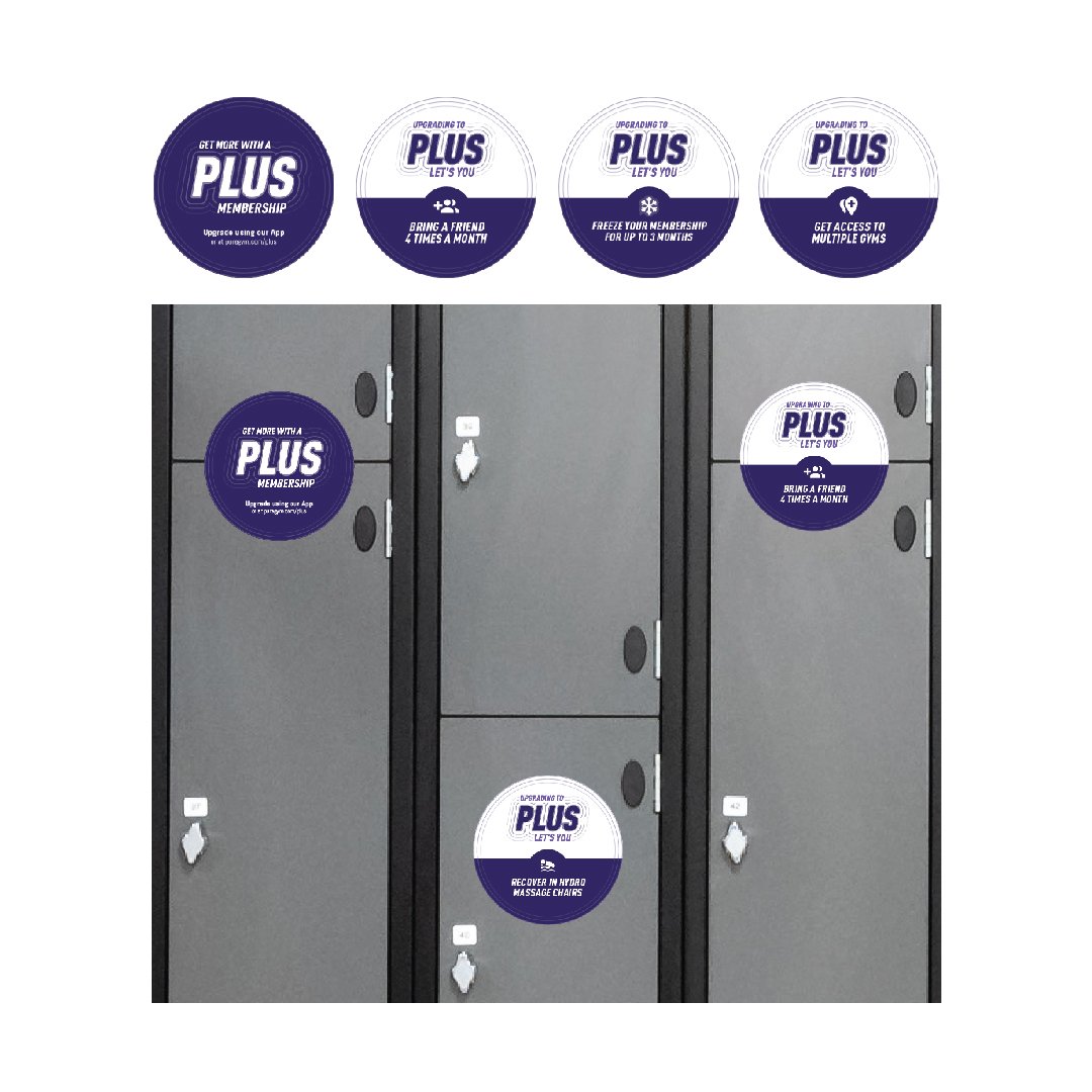
This needed to build on the current application of “PLUS”, using a purple accent to stand out across member communications in the gym and online. The “PLUS” identity got built on the concept of gain and expansion, with the introduction of a pulse animated into the identity to make this eye-catching in its marketing. The rippled pulse represents the additional benefits of a “PLUS” membership. Features got supported with imagery available in the company library. However, due to limitations regarding imagery, the application was kept simple with supporting iconography and clear copy used to advertise the benefits.