


Branding project for a motorcycle oil company
Squid is a company with it’s roots in motocross and were keen on creating a brand that would be ideal for sponsorships as well as unique product packaging.

Defining the concept
Taking inspiration from the company name, I wanted to create a brand that had a nautical element that could become iconic. The company has two core products that they want to focus on making the best in the industry which led me to give the icon some variation to it’s sides. Anchoring the concept in the motorcycle market I combined the squid with the front fork view of a bike. Type wise I wanted to create a unique wordmark that wouldn’t rely on the icon, giving the brand the flexibilty it needed for all sorts of applications.

The colour range starting with a fresh cream and burnt orange as primary, follows shades that can be related to the discolouration of motor oil. To maintain a high contrast logo across the colour range, the inverted logo is given a sticker border to maintain smaller visual details.
Bringin’ the colour


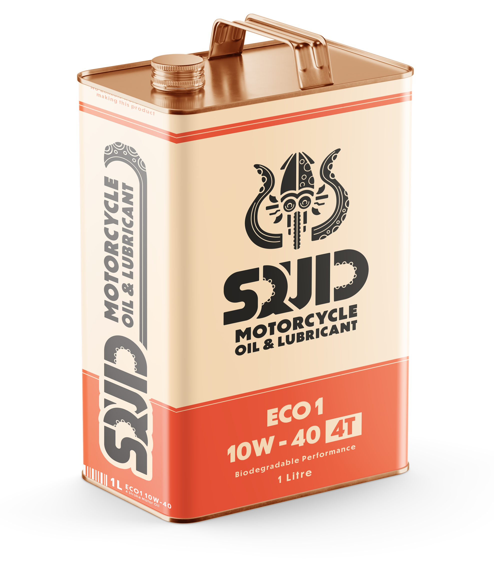
The product
Squid wanted to stay away from plastics and aims to be a leader in biodegradeble oil alternatives and an advocate for change. The concept provided shows a retro styled can that stands out from the plastic classics on the market.


Versatility was key in this project, sponsorships and motorcycle culture is a huge space full of brands being applied in the tightest of spaces or emblazoned across an entire circuit so my package made sure to provide everything from reduced detail formats to large long formats fit for banners.


