


Branding project for a marketing consultancy focused on ethical applications for AI content.

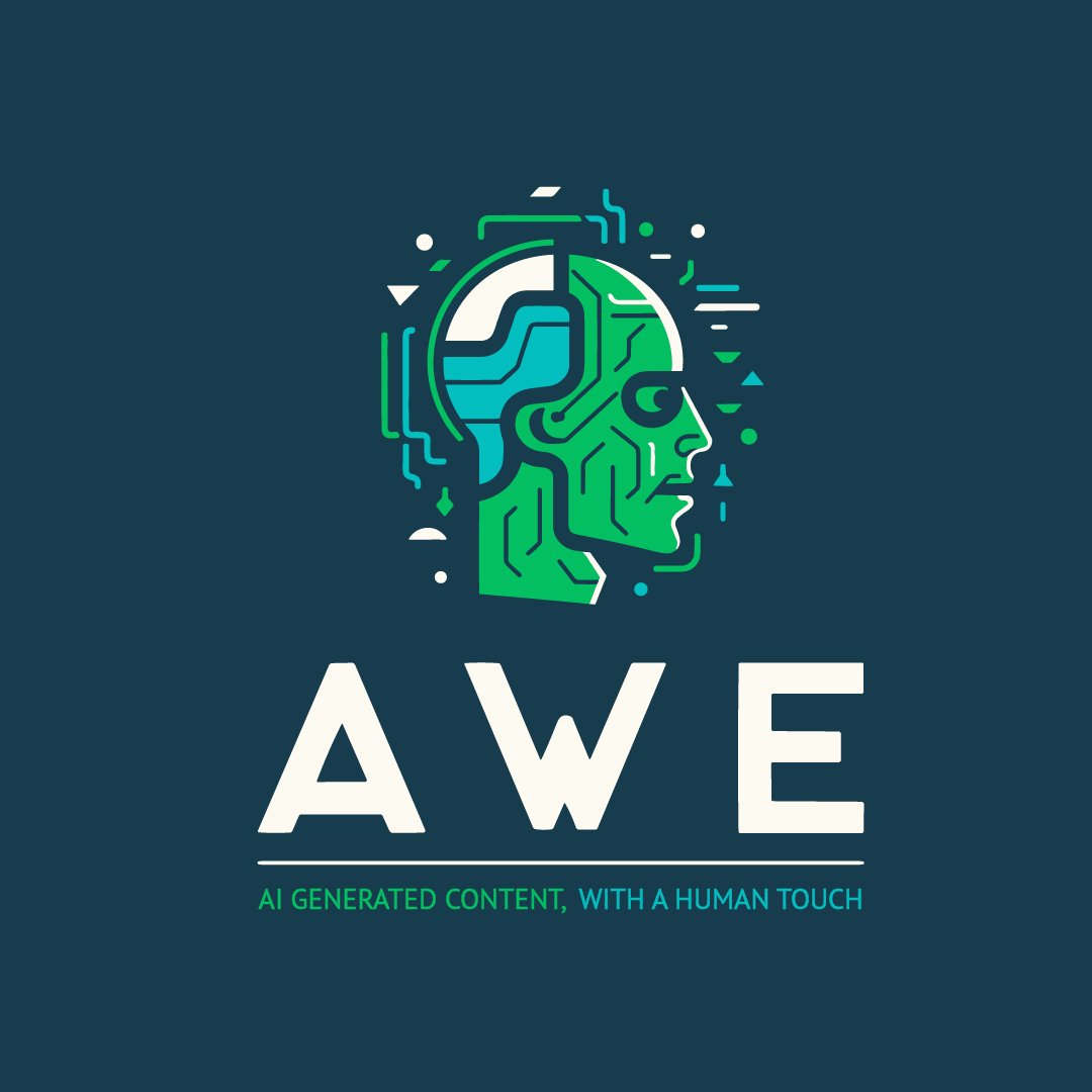
AI with a human touch.
Visual identity wanted to play on the acronym of A.C.E. (originally A.W.E. for AI Writing Expert) with the tag line of “AI generated content, with a human touch.
After initial exploration and route chosen by the client the acronym was updated to broaden the scope of services provided.
The client already had brand colours in mind as part of the brief. Firming these up, I put together some additional complimentary colours. As long as these are well managed, they would help support the identity both in my logo design and further expanding into web and social implementation of the brand going forward.

Route 1
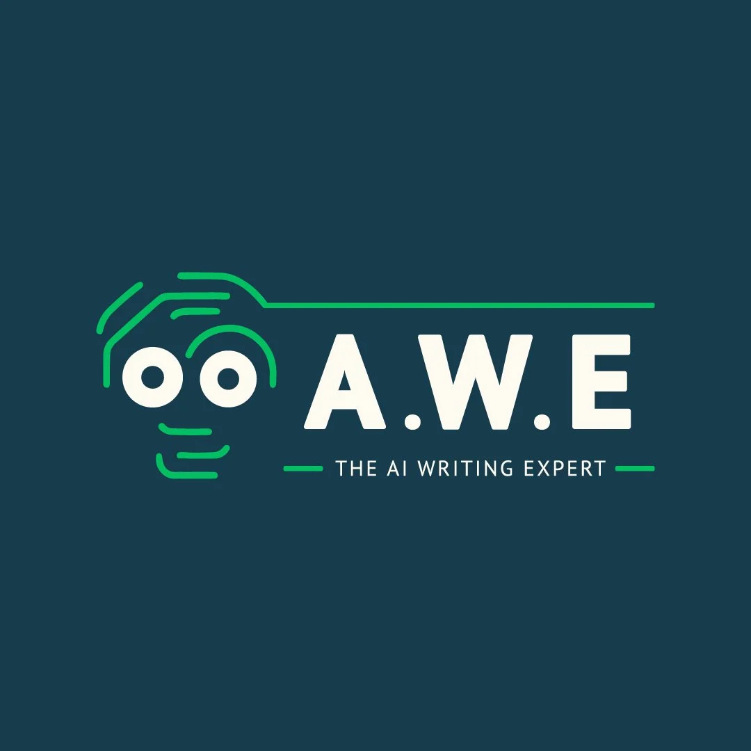
The monogram.
This is very much a design centered around the acronym becoming a unique monogram.
A secondary graphic element is introduced with the circuitry patterns. I found this to be a nice technology based element that could be weaved in to concepts to bring in the ai/machine learning component.

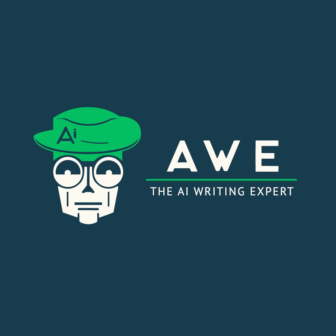
Route 2
The Mascot. Introduction of a ‘synthetic human’ like element.
AI is a scary subject, use of a character will help give the identity a sense of personality. The design focuses on creating a friendly face to the business.
This route took the shape of two characters shown below, a robot and a more ambiguous “Clippy”-esqe character. These both feel at home to be providing support as an assistant character. This helps soften it going beyond the acronym, as there are a large amount of A.W.E companies online.


WHAT IF?
WHAT IF?
Route 3
What if we let the AI do it?
Off the back of the character route, I began to speculate on how A.W.E could be supported with a character or emblem element with a big BUT… let’s generate this route leveraging AI by using MidJourney.
This image generation tool is powerful, but at the time had limitations in anything text based. After prompting MidJourney for a few options, I then refined these into the workable routes below.


Route 4
The symbol. The classic writing icon/logo is the trusty fountain pen.
Using this symbolism as a central focus, I looked to create an emblem for A.W.E. with writing at the heart of the logo.


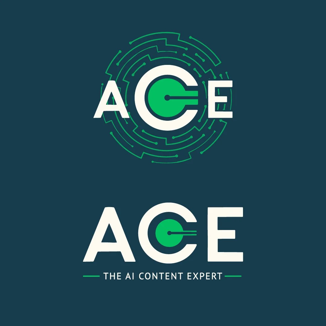
The chosen one.
And the change
AI Writing Content Expert. With this update we have our route chosen. Symbol in place can we explore ways to incorporate the change to A.C.E.


The finished design
Final emblem and lettermark give my client great flexibility going forward. Supporting elements such as the circuitry illustration and extended colours have been incorporated in initial designs for their first publications.


