
Brand identity for a new vintage clothing shop based in Harrogate
Focused on recycled and renewable fashion. The client wanted a flexible brand that could be applied in a variety of ways and styles. A key direction was to create a graffiti-esque identity that tied the brand towards 90’s urban nostalgia and streetwear. With the strength of the market, this needed to be a “wearable” identity that could gather a following from its audience and be a prominent face of vintage fashion.

What goes around... comes around
What goes around... comes around
90’s nostalgia and urban fashion in abundance

Identifiable and memorable.
My process for this identity started with how to approach the graffiti aspect. I wanted to ensure consistency in branding across various platforms, including social media, print materials, and physical spaces. But, with that in mind I wanted to nail the bold urban style.
Taking shape from an existing typeface gives a solid structure to work from and helps maintain legibility.
Building on from there, I manipulated the lettering to create a unique wordmark styled to reflect graffiti flourishes and bold shadows.

Building a flexible logo library

The client wanted a variety of logo formats that could be applied across the shop collateral and provide some variety when used on garments.


The social tease


The feature brief
THE WALL
A visually appealing and well-designed space is important for any shop. First impressions count for a new business and the customer perception of the brand on the street.
The client wanted a feature piece that could be printed to cover the back wall of the shop. This was a great challenge to build on the brand with a graffiti print that could be designed digitally and scaled for purpose.
My process for this started with a mockup of the space set in ProCreate and the concept sketched up for proof, before working up the final piece as a scalable vector asset in Illustrator.

Final artwork ready for the wall

WE'RE OPEN
WE'RE OPEN
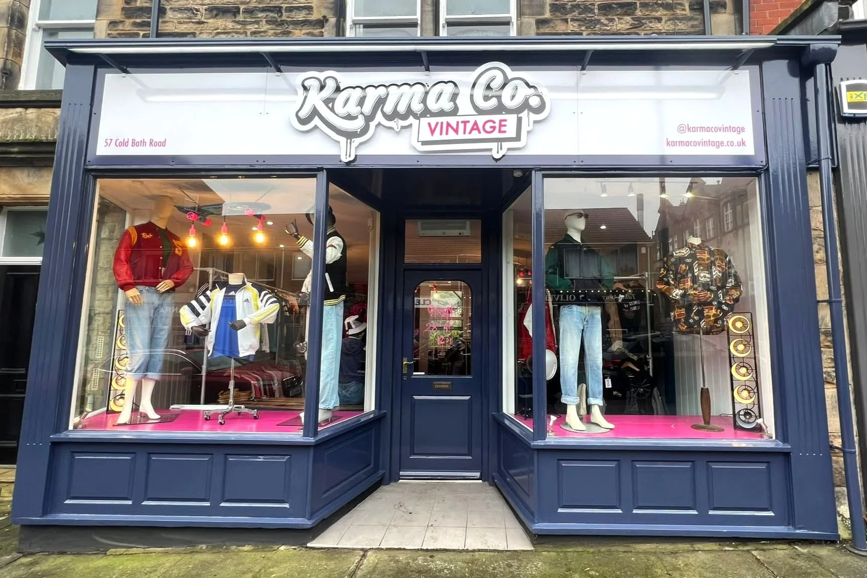
It’s been great to work with the owners to get the brand applied across signage, social assets and launch collateral.


A word from the client…
“Working with Ben on our store design & branding for our business was amazing. We felt like we were in totally safe hands. He took the time to really understand the concept of our store/brand & ensured that everything was cohesive & to our specifications.
Ben’s creative skill & attention to detail really brought our brand to life & made the entire process so much easier. We absolutely love our branding & store design features he helped us to create & so do our customers. 🤩 He’s the best creative we’ve ever worked with, we would highly recommend him.”


