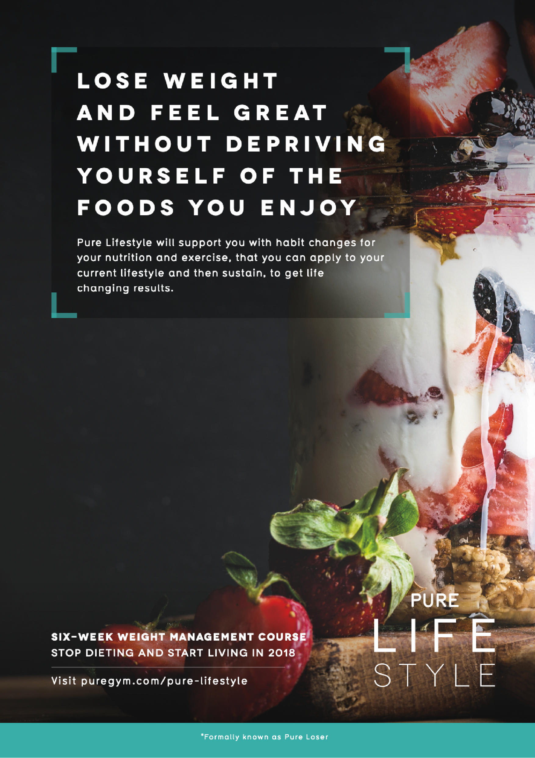
Rebranding project moving away from the poorly named ‘Pure Loser’ weight loss package sold to members at PureGym.
With the rebrand, came a partnership takeover with ‘Protein World’, introducing the restructured and renamed ‘Pure Lifestyle’ product to members, with new healthy habits for nutrition and exercise. The brief was to create a product that warranted the cost of admission and reflected the quality of the support provided by the weekly content.
The previous package came in the shape of a binder with all information and progress tracked and added weekly.

The concept is based around the change and 'refocus' that pure lifestyle provides. Helping to provide a focus on the right meals, workouts etc. With this in mind, the brand is framed by the use of L shaped corners, much like a focus on a camera.
Using the corner device we can start to build a visual style that translates into usable icons, here are a few applications I put together to show the flexibility of this style.


The initial launch saw the partnership with ‘Protein World’ give a great injection of fresh imagery and content.


Takeover complete, the product was then rolled on to use the base branding across the full 6 weeks of content.


From print to digital delivery.
To update the delivery of the course, a lot of the content was moved to interactive PDFs with a clear mobile first approach to formatting and navigation.
